


Business Flyer
Assignment: Create a flyer for your dream business.
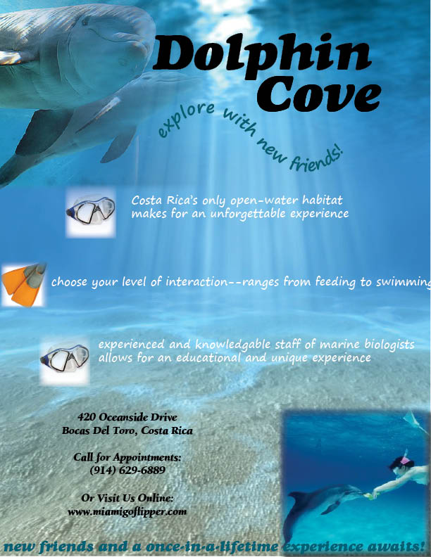
For my "dream business," I created a flyer for swimming with the dolphins. The background of the flyer is a picture of the ocean looking up at the surface from the bottom. There is a bright spot in the water where the sun is coming through, and I placed and feathered a picture of two friendly-looking dolphins right next to the bright spot. This way, the rays from the sun are coming out from the dolphins making them appear angelic and hopefully triggering a positive response from potential customers. I named the business Dolphin Cove, which is the most prominent text on the flyer, and added the subtitle "explore with new friends!" to make the experience come across as more interactive. I incorporated a snorkel mask and flippers as bullets to pinpoint the advantages of this particular service in comparison to competitors while keeping it creative. In the bottom corner I feathered an image of a woman feeding a dolphin underwater so customers know that our services are legitimate. I included the company's address, phone number, and website so that customers have every opportunity to contact us if they which to use our services. Finally, I labeled activites at Dolphin Cove as a "once-in-a- lifetime experience" to seal the deal with tentative parties.
Album Covers
Assignment: Create an album cover (both front and back) for the band of your choice.
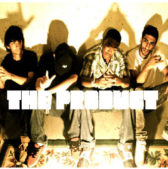
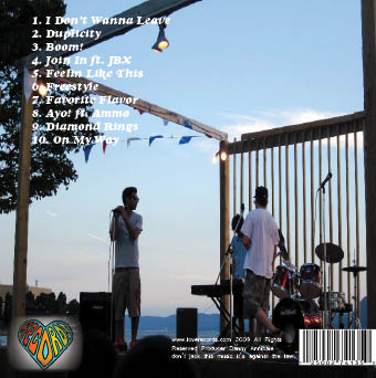
To catch the eye of potential music buyers, I used a picture of the band ("The Product") that made good use of negative space (as seen through the shadows in the background of teh musicians) and included all of the band members. I placed their band name in very thick white lettering across the middle of the image to keep the message clear, even at a quick glance. I chose for this to be white to add to the overall monochromatic look of the photo. For the track listings on the back side of the album, I again utilized thick lettering for clarity, but this time switched to a slightly different somewhat italicized look for variation. The record label which produced this album is "Love Records," which I made apparent in my logo; a heart with the word "records" filling the inside in accordance to the lines and curves of the shape. Each letter in the word records is a different color, specifically in rainbow order, to really make the logo pop. In small font I credited producer Danny Annibale and spoke briefly about copyright infringements.
Postcard
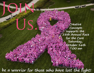
Assignment: Promote your organization's event by creating a postcard.
For the final aspect of this project, I chose for my fictitious company "Creative Concepts" to sponsor Susan> G. Komen's Race for the Cure. I wanted to portray the need for unity in winning the fight against breast cancer, and so I chose a single image to be the background of this postcard. The photo is of breast cancer survivors (all in pink) standing in such a way that they have created a giant pink breast cancer ribbon (contrasted against grass). Next to this I placed the largest and clearest text with a simple message: "Join us." (also in pink). I utilized the empty spaces surrounding the ribbon to incorporate information about the race, and attempted to persuade participants with the slogan "be a warrior for those who have lost the fight!" I kept text very minimal throughout this ad to keep the message short and sweet, utilizing white font for simplicity and clarity.